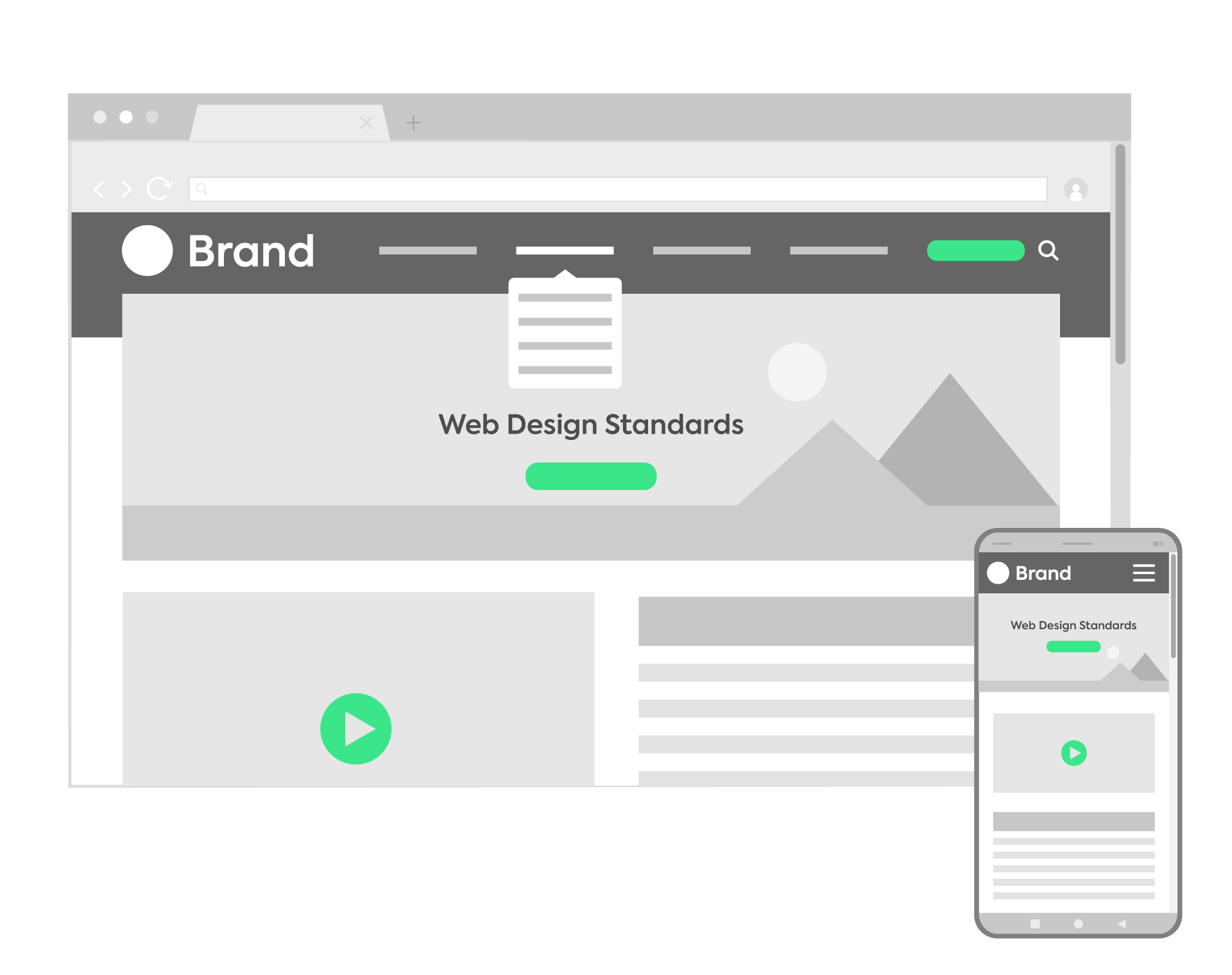
Web design standards are specifications or recommendations created by the W3C in 1994 to standardize and provide consistency to the World Wide Web, making the different technologies on which it is based compatible with each other. These guidelines allow us to create accessible, interoperable and efficient websites to ensure accessibility and universality online.
This makes a designer or developer’s work much easier, as it is not necessary to create different versions of the same website for each browser, device or operating system on which it is running. With a few small adjustments in the code, we can display websites identically, regardless of device.
Types of web standards
Technical web standards
It is important that websites are compatible with all browsers, as well as with as many older browser versions as possible, in addition to creating a stable web experience, regardless of the device used to access the site.
To do this, we stick to technical web standards related to the languages used for website development. The primary and most common ones are HTML5, CSS, and JavaScript. (Although there are some websites developed with other languages such as AngularJS or Vue.js or obsolete technologies such as Flash).
- HTML5 (HyperText Markup Language) is used to define the document’s structure.
- XML (Extensible Markup Language) is used to store and exchange structured data.
- CSS3 (Cascading Style Sheets) is used for content style and design.
- ECMAScript defines the creation of scripting languages, with JavaScript being the most widespread API for client-side programming. It allows for the creation of dynamic web sites.
On the other hand, the most common formats for audiovisual content are generally:
- Images: JPG, PNG and WebP (a web-specific format supporting both lossy and lossless compression).
- Vector graphics: SVG.
- Sound: MP3 is the most widespread format.
- Videos: the most supported format is MP4. In addition, videos encourage users stay longer on your website and engage with your content.
Web design standards and usability
Design standards are related to appearance and allow to unify the way information is presented. These are some conventions and best practices recommended for a satisfactory user experience:
- Visual consistency among all pages and elements that are part of the website, as well as in voice and tone, adjusting the design to your target audience.
- A well-differentiated visual hierarchical structure, for example:
- In the proper sizing of headlines and content with legible fonts and colors.
- Reads from left to right (F pattern).
- Use color highlights sparingly. They generate contrast and help us to differentiate the most important elements, such as buttons or links.
- It is very important to use white space or margins appropriately. They are like the silences in music: they allow the design to breathe, working as a safety zone to protect the design from interference, and helping to organize and separate the content visually. White space is key to good design.
- Highlight your value proposition by including it at the top of the page, usually within the hero and h1.
- Use Calls to Action (CTA) such as ‘Book now’ or ‘Request a quote’, not just ‘Contact us’ buttons.
Some conventions or pseudo-standards generate controversy, but are still widely accepted, such as:
- Placing the logo at the top left of the page. The user is accustomed to seeing it there and it follows the F pattern, but there are many websites with the logo centered or on the right (like ours!).
- Main navigation at the top of the page on desktop.
- Responsive navigation:
- Menu icon within thumb’s reach (usually on the right if the understanding is that most users are right-handed).
- Drop-down menu.
- The ‘hamburger’ menu icon makes navigation easier as it has a high recognition factor.
- Contact at the top right (usually within the menu).
Web accessibility standards
Accessibility standards are guidelines for making websites and their content accessible and inclusive for as many people as possible (including people with disabilities, such as visual, hearing, cognitive or motor impairments).
- Alternative texts for images and transcripts for video and audio.
- Keyboard input for those who do not use a mouse to navigate through websites.
- Labels for form fields.
- Correct color contrast.
- No content that flickers or moves.
- And of course, correctly labelled the content in HTML.
Privacy standards
Privacy is an essential part of the Web. Privacy standards define the mechanisms by which users specify their preferences regarding data privacy issues. Of primary importance:
- Legal links should always remain visible and accessible as the final element in the footer, usually next to the copyright. They usually have a smaller font size with respect to body text to make them more discreet.
- Respect for the user’s privacy.
- Non-invasive requests for permission.
- Duty of protection, discretion, honesty and loyalty.
- The user can exercise their right of access, deletion, correction, opposition, etc.
At All Around we can help you create a website that meets and exceeds web design standards for a flawless web user experience! If you need a hand with web development or web design, don’t hesitate to contact us. We always design and develop your website following the standards set by the W3C.


