Although at first glance it may seem like images are a completely different beast than text, they are not that different from one another when it comes to the way in which they are digested and interpreted by humans. Whether a static photo or drawing, an animated gif or video, when a spectator sees one of these formats, she takes in and contextualizes what she sees to extract meaning. The same thing happens when you read, anything, even this text. Right now, dear reader, your brain is relating these words in this post, putting them in perspective of a blog related to marketing and assigning them concrete meaning. And you finish reading and you see this:

In a different situation, that image might have signify something else entirely, but here, most likely you’ve made the association of “okay, this is my brain linking ideas and contextualising concepts when I am confronted with an image”. If this post were instead about Alzheimer’s, perhaps your first thought would have been brain plaque or neurons, or something to do with the process of the disease. In summary, context is everything: use gifs and video always with this in mind.
Let’s review some of the most common image types in the digital world and how they can be used to communicate or transmit information.
GIFs
How is it pronounced? No one knows. But this little information unit has been hard at work almost since the dawn of the Internet, even experiencing a rebirth in recent decades. The big difference between a GIF and a still photo is that time comes into play; a gif tells a story in space and time. It is the bare bones, minimum expression of video. GIFs are useful to communicate ideas simply and quickly, such as emotions or a basic piece of information. Using a GIF as the sole vehicle to deliver your message is complicated, unless you use quite a few to articulate a coherent more involved tale, but we wouldn’t recommend this. The best use of this format is as a complement to text in which a more elaborate story is told.

VIDEO
The big, older brother of the GIF shares many of its same characteristics (space and time) but in a more prolonged format. It’s is a format that doesn’t necessarily require any text to back it up, and can successfully transmit larger stories and complex ideas with no assistance. Video can be short (just a few seconds) or long (an hour or two). Within Marketing, video is often used to develop ideas in presentations or to showcase products or services (whether by spot, YouTube video or an Instagram story). Currently, this format is the strongman of the digital world due to its ability to communicate and go viral on social platforms. A preferred video format for these social networks and mobile phones is the “mute” video, in which text is over-layed like subtitles and additional text information is provided so that the content makes perfect sense without sound, as users frequently don’t have their sound activated on these networks and devices.

INFOGRAPHICS
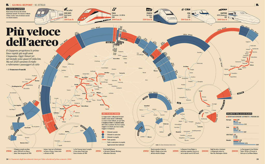
This format emerged from the need to transmit more complex chunks of information at a glance. We might say that the infographic is the shining star of statistical graphics. Joan Costa, in his book “Schematics: Visualising Information” calls this art “schematics”. An infographic is essential when one wants to transmit very complex statistical or numerical information to the user in a manner that is quickly understood and digested. Graphic design heavy-hitter principles often enter in this art: the ability to synthesise information, the use of colour to distribute information conceptually, or the understanding of typeface hierarchies in the distribution of blocks of text.
This graphics are commonly employed in government publications, presentations of final results or educational materials.
 Infographic by designer Francesco Franchi
So what do you need to bear in mind when selecting and correctly using these formats? The most important rule of thumb: whatever today’s use is, it will probably change tomorrow. We all know the specifications for graphics in social media– we’ve learned that square and vertical formats work better than landscape on social and our phones, but this may very well change with time. Instead of focusing on technical specifications, which are ever changing, it’s best to focus on universal and constant aspects.
Before you go wild developing one of these three formats, remember to stay focused on the goal of your visual communication, taking into account if your visual will be featured with other communication devices (text, music, etc.), and in what context it will be displayed. This will make it a lot easier to avoid messaging pitfalls and be clear on what emotional and informational content you are delivering to your recipient.
Ah! And remember! Context is everything!
More posts about: Increase brand awareness


