Despite the fact that advertising has evolved into a complex science of surgical precision, it’s core tenets have not changed very much. At the beginning of the 20th century, barber shops would put a blackboard out on the pavement displaying the discount a customer could receive if they got their haircut immediately. The offer, combined with a hypnotising spinning barber’s pole striped in red and white, captured clients’ attention, making them think there was no time like the present to get their hair in order.
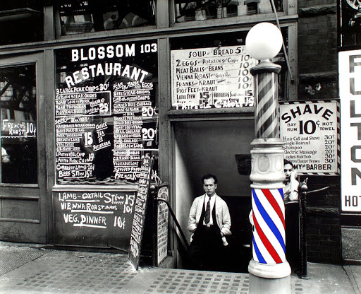
In a way, landing pages are the digital, and logical, evolution of the barber’s simple but effective techniques to “capture leads” and clients.
The point of this comparison is not just to give a vintage air to this article, nor to take advantage of any nostalgia for the past. Well, maybe a little. But the primary reason to remind us that the arts of persuasion employed in landing pages are based on many decades of human experience in the area of marketing, and the principle that simplicity is often the key to success.
The landing page has a purpose: to sell a product or a service. For this reason, my intention is not so much to give the 10 commandments of landing page creation, but rather to highlight points that relate to the most important aspect of landing page creation:
“Any, I repeat, any item that distracts the user from purchase shall be set aflame, relegated to the rubbish bin of useless marketing hacks, outcast, forgotten, sealed in a black box and buried deep in the Texas desert.”
Is that clear? As users, we are procrastination machines, easily distracted by any little stimulant or sidebar. The landing page must be that element that catches the attention, focusing on what your business wants to sell, and throwing out all that is unrelated as much as possible. Now that that is out of the way, we can proceed to our commandments, in this case, we’ve got seven. So much for not getting biblical. Here we go:
- Analyse your target audience: As it’s likely that the aspect and claims of the product you are selling are already defined, focus on speaking the language that will attract and capture your target’s attention.
- Opt for the simple: Excessive elements mean too many potential distraction points. Direct your target audience’s attention to the offer at hand and the Call-To-Action (CTA) button.
- Mind your copy: The way in which you describe what you are offering is the way you are speaking to your target. Be concise, direct, persuasive and convincing. You’ve only got a couple of milliseconds to capture their attention.
- Offer something in exchange. Some landings are focused on newsletter subscriptions or encouraging users to leave their contact information so that it can be used in a later sales strategy. In these cases, I recommend offering something in exchange (a free product or a downloadable asset for example) in order to nurture your potential client’s loyalty and help them to understand that your business rewards their actions.
- The offer and the CTA must always be visible: Do not force your users to scroll in order to see either of these two elements. Anything that keeps them from reading, completing the action or clicking on your offer is a roadblock to conversion.
- Don’t ask for too much. As users we do not like to be asked for too much information; we prefer to hand over what is strictly necessary for purchase. Only ask for what you need.
- Mind your design: Remember: corporate, simple and very very sexy. Do not overdo your colour scheme, an don’t let any design element distract from the product or the CTA. Ensure that your landing page design is an attractant to the user, much like the smell of freshly baked bread from a bakery. Who can resist going in and buying a baguette?
Now let’s get back to the barber shop. Why? To remind ourselves that landing page creation is a discipline that despite appearing modern is based on age-old rules of stimulation, perception and the art of persuasion. Of course, we shan’t forget that the digital world has its own norms, but these have been created to continue with an age-old tune:
Look, act, purchase.
Hey! What’s that pole spinning round?
More posts about: Generate more leads

